No political baggage
No highlighted borders, no arbitrary centralities, no scales that mislead.
World cartography
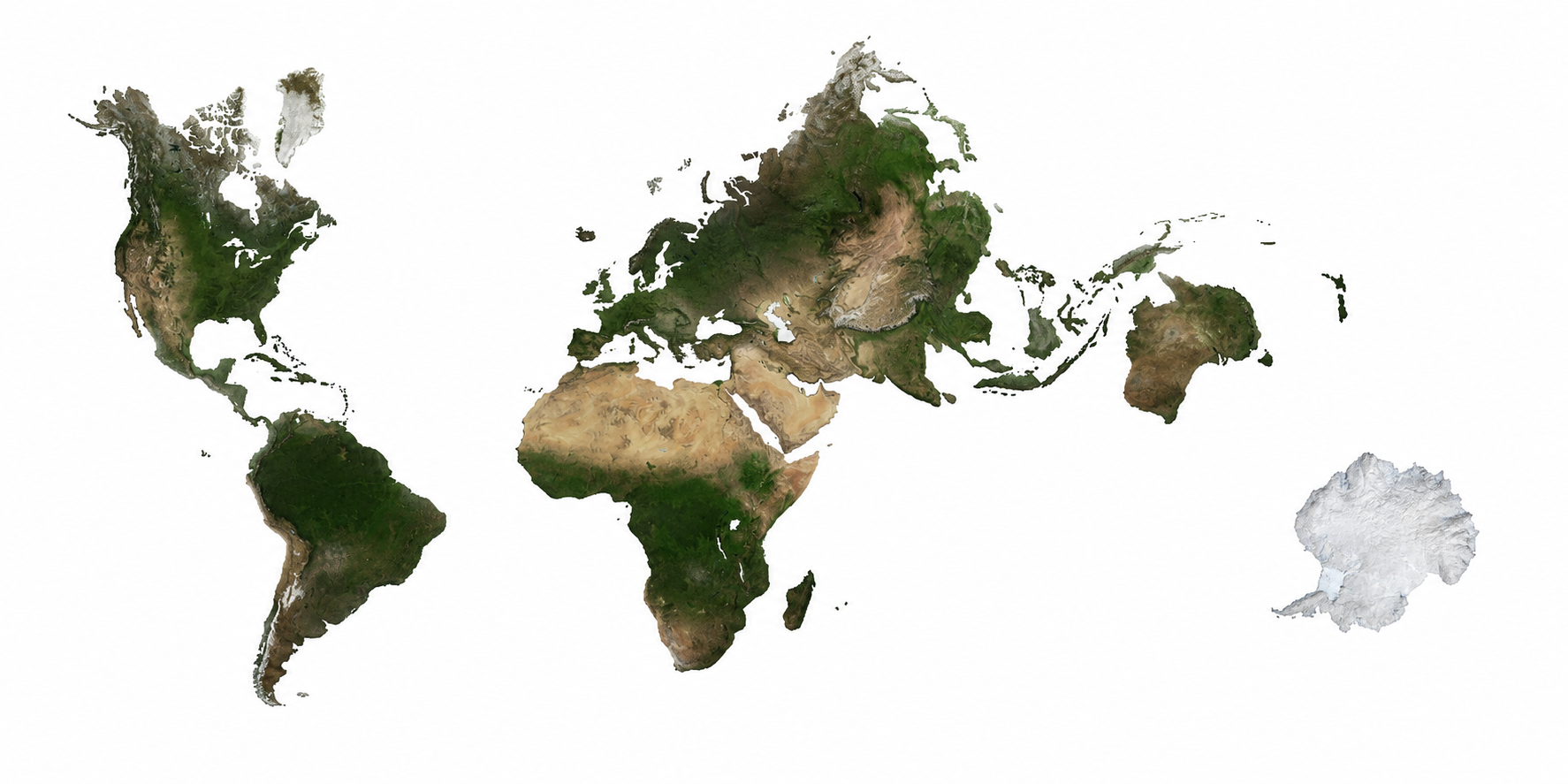
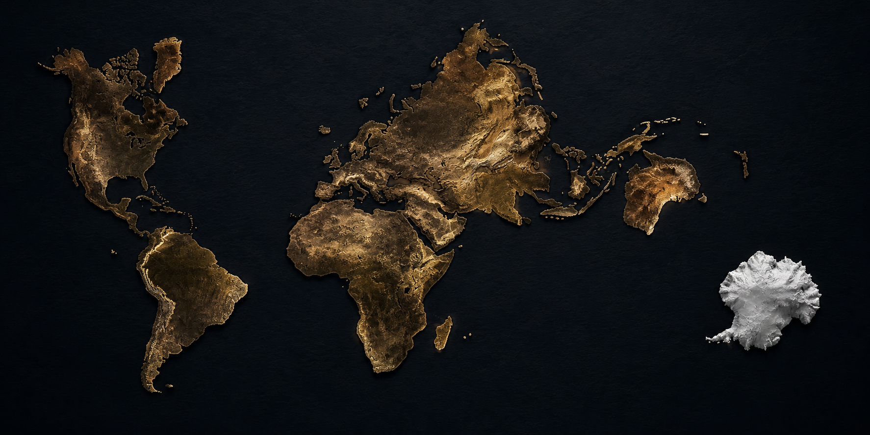
Real Earth is my personal contribution to cartography. A humanistic and pragmatic proposal to see the planet printed on a sheet of paper at real sizes — without the distortions or political baggage of the everyday and school maps we inherit.
Every projection is an opinion. Let's choose it deliberately.
About the project
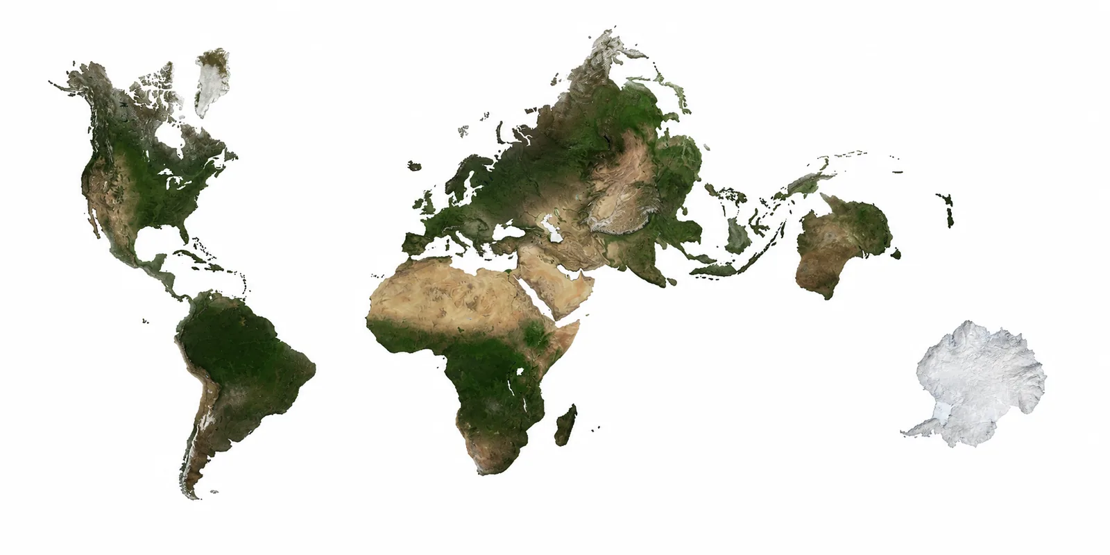
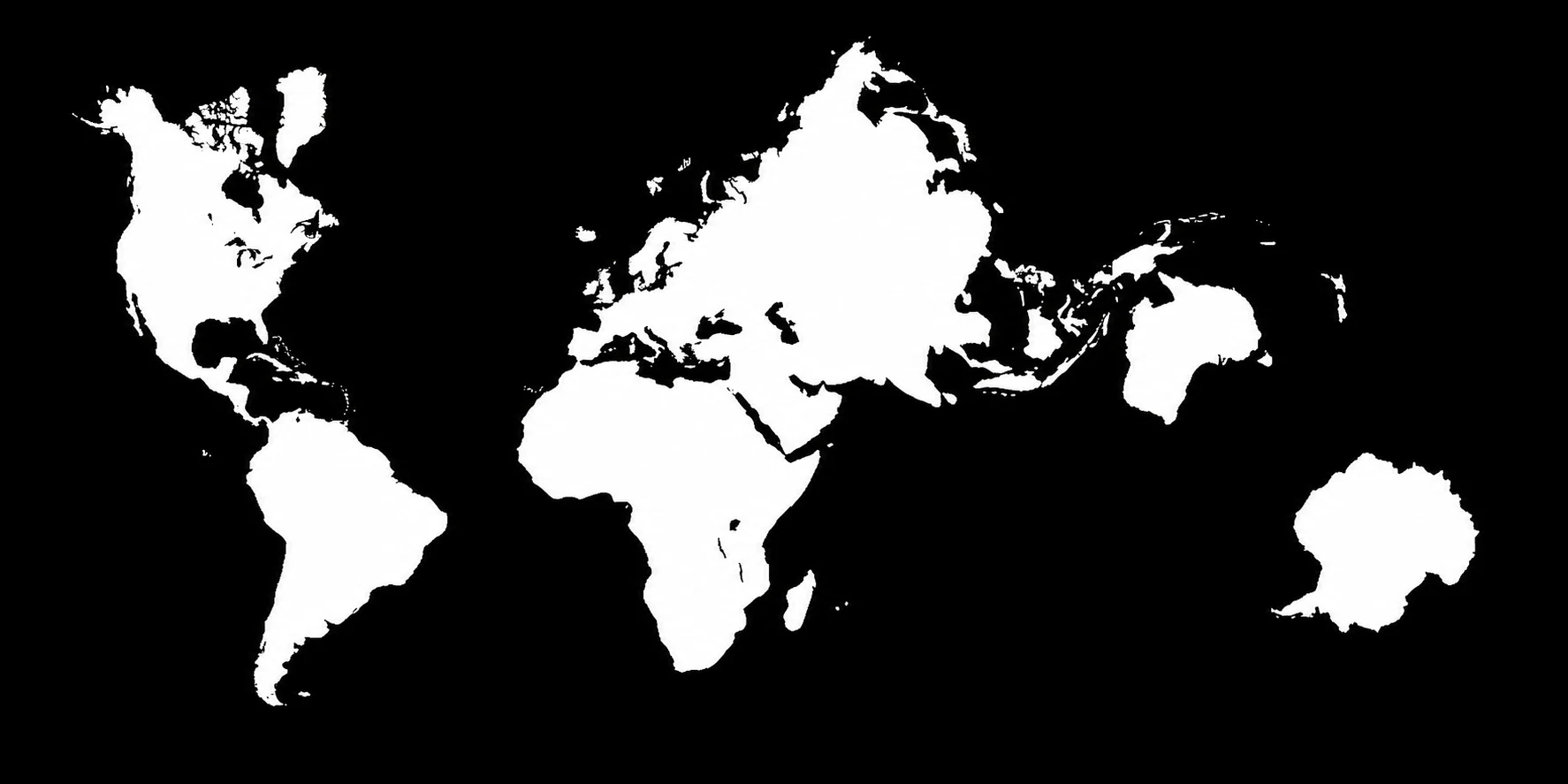
I've always seen school maps as biased. They show a world where Europe is large and central, Africa looks smaller than it really is, and Antarctica is reduced to a strip at the bottom of the map. This site is my personal contribution to cartography — a humanistic, pragmatic, non-mathematical attempt to square the circle: see the planet printed on a sheet of paper with real sizes.
I arrived at this proposal without taking previous cartographic work as a direct reference, deliberately seeking new solutions from scratch. The work has been manual and laborious — surely someone will be able to refine it computationally, but this approach was what mattered to me. Real Earth is not a repository of infinite iterations: it is my closed proposal, open to the world.
No highlighted borders, no arbitrary centralities, no scales that mislead.
A pragmatic proposal made from experience as a map user, not from academic mathematics. Manual, laborious, open to being refined by others.
The maps are published under CC BY-SA 4.0: free use (including commercial) as long as the source is credited. If you use the images, the method or create a derivative version, please credit "Real Earth · Mosaic-23 Xara".
When you use any map, method or variant of this proposal — in an article, book, classroom, website, exhibition or derivative product — credit the source with one of these forms:
Real Earth · Mosaic-23 XaraReal Earth · Mosaic-23 Xara projection (CC BY-SA 4.0) · realearth.catIf you create a derivative version (recentering, thematic variants, teaching resources, etc.), the CC BY-SA 4.0 licence requires sharing it under the same licence.
What it brings
Compared to Mercator, Gall-Peters, AuthaGraph or Dymaxion, this proposal brings together for the first time a set of properties that no conventional projection offers at once.
Seen from above as one more continent — not as a flattened strip at the bottom (Gall-Peters) or infinite at the edges (Mercator).
Africa regains its real size (14 times larger than Greenland, not smaller as in Mercator).
Every continent looks the way it actually is, without vertical stretching (Gall-Peters) or horizontal distortion (Mercator).
Fits books, screens and posters, readable at a glance, no interruptions or unfoldings (unlike Dymaxion).
Keeps the cognitive familiarity of traditional world maps without forcing the viewer to relearn the planet's layout.
Divided by recognisable regions — India, Arabia, Madagascar... — not by arbitrary triangles (AuthaGraph) or icosahedra (Dymaxion).
Distortion is pushed to the seams — oceans and deserts where it doesn't visually matter.
Proposal
This is my cartographic proposal. It is not an iteration log or a repository open to endless versions — it is the personal contribution I want to leave to cartography, with its visual variants for different uses. If you want to collaborate on specific adaptations (recentering on another region, thematic variants, high resolution for printing), please contact me directly.

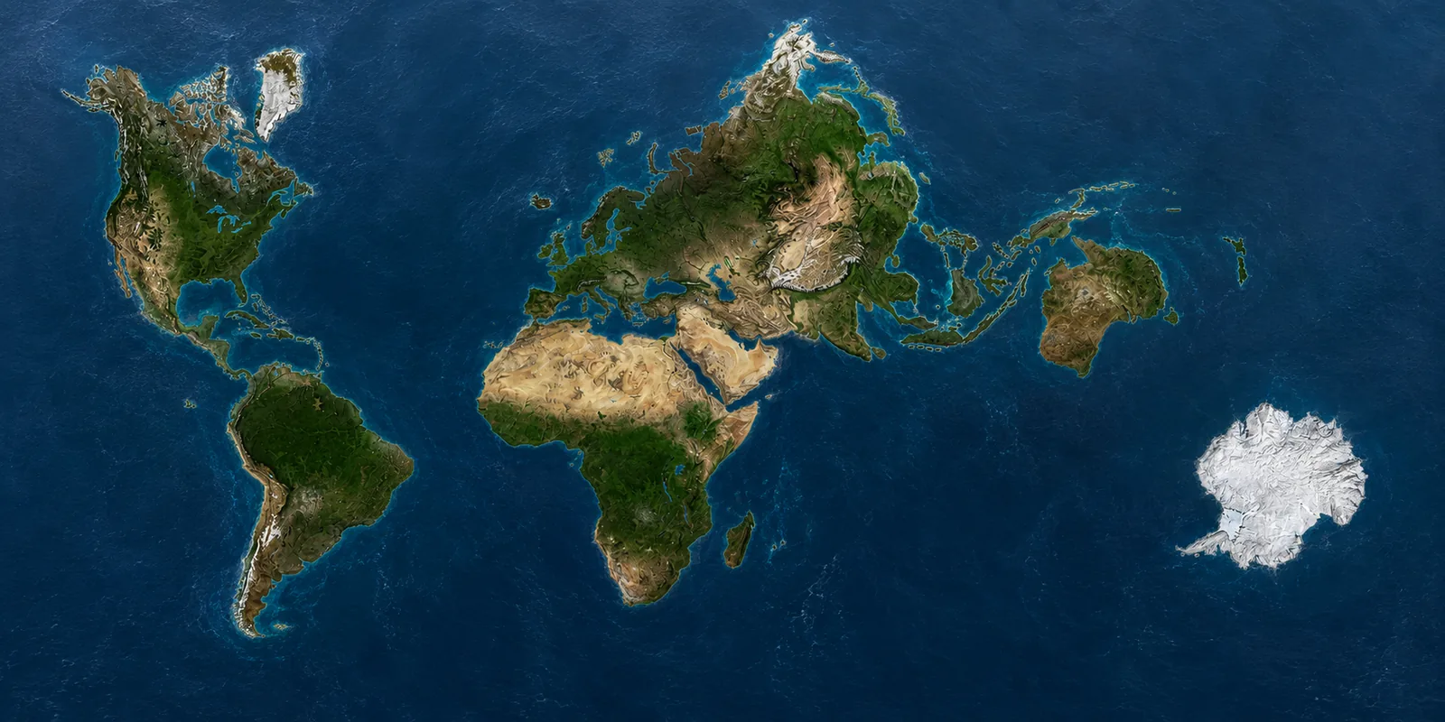
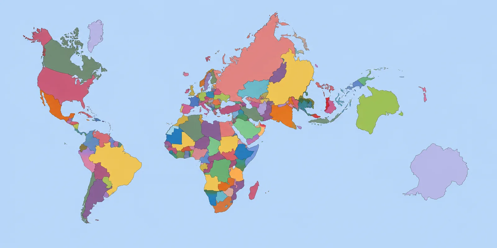
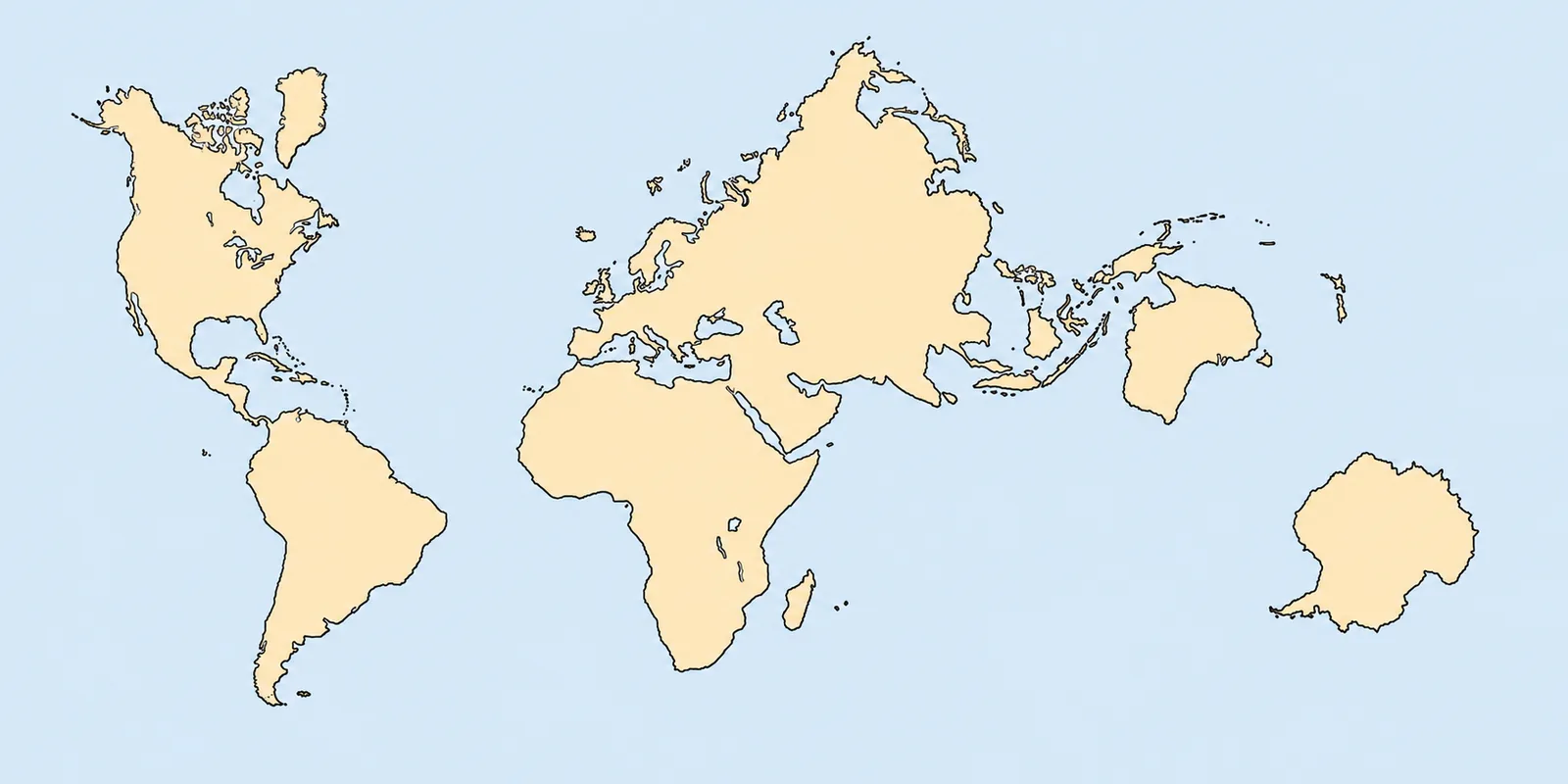
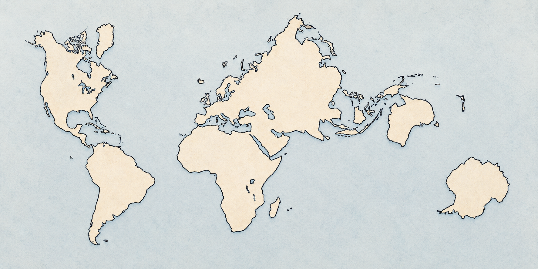
Each continent with its own optimal projection, visually chained by shared boundary points. Nine visual variants — same geometry, different aesthetics.
Download any variant at maximum resolution in uncompressed PNG or optimised WebP.
Maps with flat colours and high contrast, intended as a starting point for creating new thematic variants or for technical print.
A 2D world map always distorts something: angles (Mercator), areas (Gall-Peters), shapes (Robinson)… a single cartographic projection is an impossible compromise.
Don't use a single projection: each continent or region gets its own optimal projection centred on its own geographic centroid. Then the fragments are composed onto a flat canvas.
For each piece:
R that brings it to the projection's north pole.Indonesia, Thailand and the entire Indo-Pacific region are rendered with an orthographic projection (3D view from space). This shows the natural shape of the Indonesian archipelago as it would really look.
Painted in layers with alpha-blending over a uniform ocean background.
A flat map where each region keeps its authentic local shape, with connections manually tuned to minimise gaps and overlaps. Visual compromises are pushed into the ocean (open spaces) instead of the continents.
For press
Includes press release, fact sheet, FAQ, quotes for interviews and the four high-resolution visual variants of the map. Free for editorial use with credit "Real Earth · Mosaic-23 Xara".
History
This section is split in two. Historical timeline: real maps from their era showing what humanity knew at the time. Projections on today's world: the same mathematical systems applied today over complete geography to see how each one actually distorts.
Real maps from their era — each one is an artefact made at its moment and shows the world as it was known then. Starts at Blue Marble (1972), the first complete view of the planet, and the thread ends in remote antiquity.
.jpg)
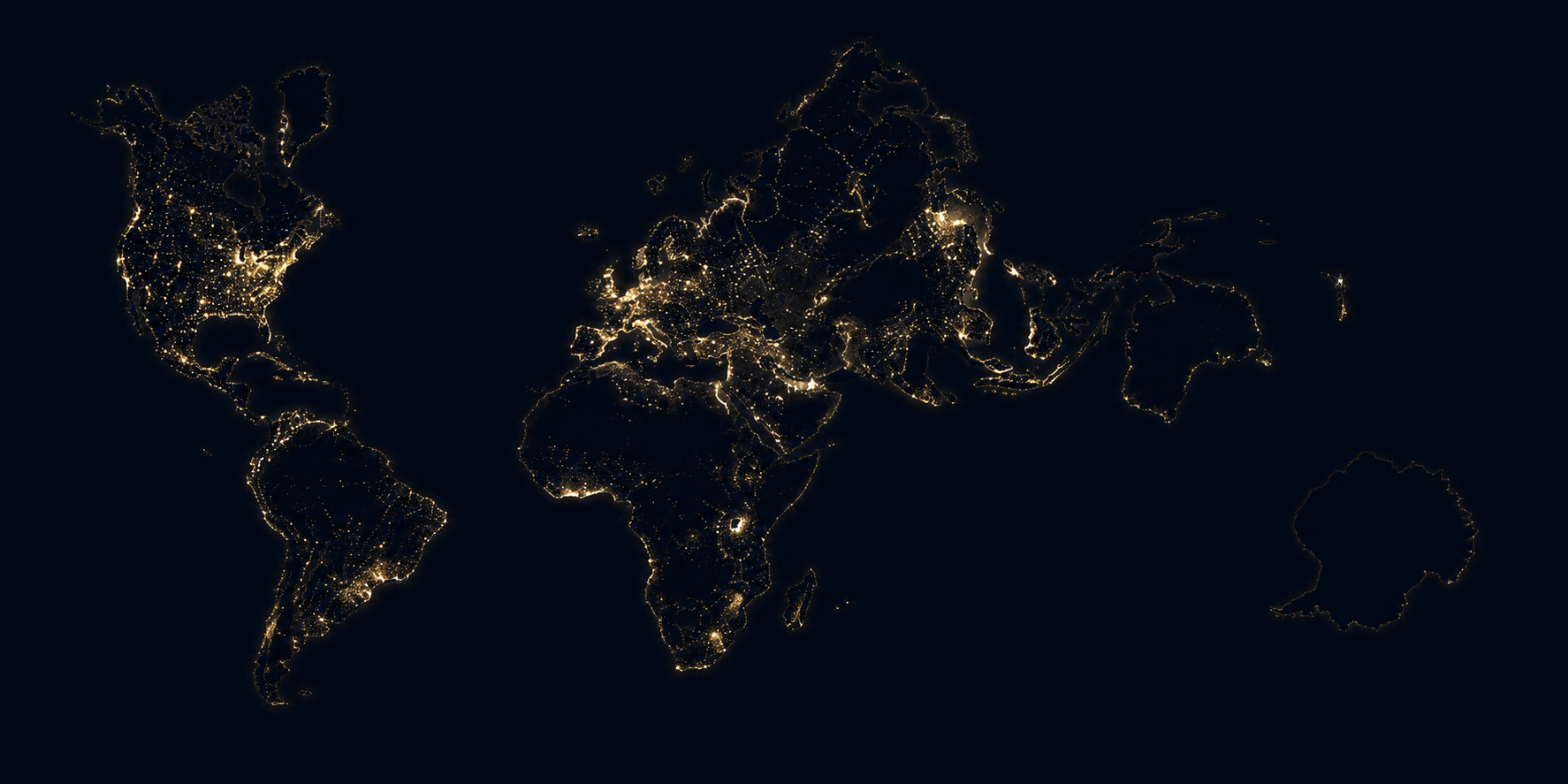
The first complete photograph of the whole planet, taken on 7 December 1972 from about 45,000 km. For the first time, humanity sees Earth «as it is»: Africa, Arabia, Madagascar and Antarctica in a single image. This photo marks the zero point of what we consider «modern cartography» — every later representation is a variation on satellite data.
.jpg)
First image taken by the Landsat programme on 25 July 1972 over Dallas (Texas) — the first civilian satellite designed specifically for Earth cartography. Launched just months before Blue Marble. It opens the era of automated cartography: all modern digital cartography (Google Earth, OpenStreetMap, ICGC…) descends directly from this programme, now in its 9th generation (Landsat 9, 2021).

One of the first general maps to incorporate the Antarctic coastlines discovered by the British expedition of James Clark Ross with HMS Erebus and Terror (1839-43). Victoria Land, the Ross Sea and the ice shelf are visible — geographic landmarks Ross named, appearing for the first time with a real outline after three centuries of imaginary «Terra Australis».

The first map showing the Pacific fully charted — and the definitive visual proof that no «Terra Australis Incognita» lay below the southern ocean. Cook sailed as far south as 71°S without finding any continent. The routes of the three voyages, the Australian coastline («New Holland»), New Zealand and the Pacific island network are visible. After this map, the «known» world left essentially only the poles to discover.

The most influential world map of the 17th century, with European cartography at its peak. Double hemisphere, baroque decoration, foreshadowing what would become Blaeu's Atlas Maior (1662-72) — the most expensive and sumptuous commercial atlas ever published (11 volumes, sold for the price of a house). An imaginary «Terra Australis» still appears, but the Americas and Asia are already quite accurate.

The original map printed in 18 sheets («Nova et Aucta Orbis Terrae Descriptio…»). Conformal projection designed for maritime navigation: straight lines correspond to constant-bearing routes. It enormously distorts areas at high latitudes — it is the origin of the «problem» in modern school cartography. Look at the bottom: Mercator draws an imaginary «Terra Australis», because Antarctica wouldn't be discovered until 1820.

Surviving fragment (approximately 1/3 of the original map) painted on gazelle skin. It shows the Atlantic, West African coasts, Brazil and a southern strip that has fuelled centuries of debate. Piri Reis himself explains he synthesised Arabic, Portuguese, Spanish and now-lost earlier sources — including a map attributed to Columbus.

The oldest surviving terrestrial globe. Built in Nuremberg shortly before Columbus reached America — it does not show the American continent. A reminder that every representation is a child of its moment.

Synthesis of European geographic knowledge just before the great voyages of exploration. Circular and oriented with south at the top (Arabic convention), it gathers information from merchants, navigators and Arabic maps. Preserved at the Biblioteca Marciana in Venice.

Capital work of the Majorcan cartographic school. The 8 panels combine a Mediterranean portolan chart with detailed representations of Africa and Asia, full of kings, cities, animals and myths. It includes the first known representation of Mansa Musa in Mali. Preserved at the Bibliothèque nationale de France.

Commissioned by King Roger II of Sicily to the Andalusian geographer Al-Idrisi, it was the most accurate map of the known world for three centuries. Oriented with south at the top following Arabic convention. This version is the modern reconstruction by Konrad Miller (1929).

Alexandrian geographic treatise that systematised projection with latitude and longitude coordinates — the foundation of all later mathematical cartography. The 1482 Ulm printed edition (shown here) recovered its tables during the Renaissance and was the European standard for generations.

The oldest surviving world map. A small clay tablet with Akkadian cuneiform showing Babylon at the centre, surrounded by the Euphrates, a circular ocean and seven triangular islands with mythical lands. Preserved at the British Museum.
The same mathematical systems applied today over the complete geography of the planet (over the NASA Blue Marble base). This shows what each projection truly distorts.

Rectangular projection derived from an unfolded tetrahedron. It preserves the relative areas of continents and oceans with great fidelity. It won the Good Design Grand Award in Japan. The image is a public approximation of the projection (the official version is patented by Narukawa).

Octahedral butterfly-shaped map that minimises distortion by splitting the globe into 8 triangles. It preserves continent shapes quite well and can be assembled in multiple ways.

Equal-area projection popularised as a political alternative to Mercator. It preserves real areas — Africa stops looking smaller than Greenland — at the cost of distorting shapes.

It preserves neither areas nor angles, but seeks a visually pleasing compromise. National Geographic used it as standard for decades.

Projection on an unfoldable icosahedron. It has no fixed «up» — it can be oriented many ways — and shows all continents as a single connected island.

«Interrupted» map that cuts the oceans to minimise continental distortion. It combines two equal-area projections (Mollweide and Sinusoidal) and faithfully preserves areas.

Compromise between area, distance and direction. Adopted by National Geographic in 1998 as successor to Robinson for its smaller distortion near the poles.

Equal-area pseudocylindrical projection with an elliptical shape. Widely used in global thematic cartography — population distribution, climate phenomena — for its area fidelity.

The same mathematical algorithm of Mercator (straight lines = constant compass bearing) applied today over the real and complete geography of the planet. The «problem» becomes obvious — invisible in the 1569 original: Greenland looks larger than Africa (it's 14 times smaller), Antarctica stretches to infinity, northern European countries inflate.
Settings
Catalan and English are fully translated. Other languages currently show Catalan content while translations are in progress.
Light mode for comfortable reading. Dark mode for better contrast when viewing maps.
Adjust the size if you want to read the projection technical descriptions more comfortably.
Keep Real Earth always within reach, even offline.


